An elaborate prank... Pigeons: The Life of a Showbird
Last year, Zac and I began planning Christmas gifts early. One of our good friends wanted to organise a "friendsmas" together, so for her, we planned two things: a thoughtful gift and an unhinged gift.
Said friend is a big Taylor Swift fan and has a deep, irrational hatred of all birds—especially pigeons. It is, regrettably, one of her biggest character flaws. Naturally, Zac and I landed on the perfect plan: to convince her that the Natural History Museum in London was hosting a Taylor Swift × Pigeons exhibit complete with a petting zoo, and our gift to her were tickets for all three of us to go!
For the record: I did not act alone. Zac was a co-conspirator from day one. Even though he rolled his eyes every time I, cackling, announced a new layer of commitment to the bit and Took Things Too Far™ again, I must say he made for an excellent editor-in-chief.
I'm pleased to share the results with you: Pigeons: The Life of a Showbird.
Research
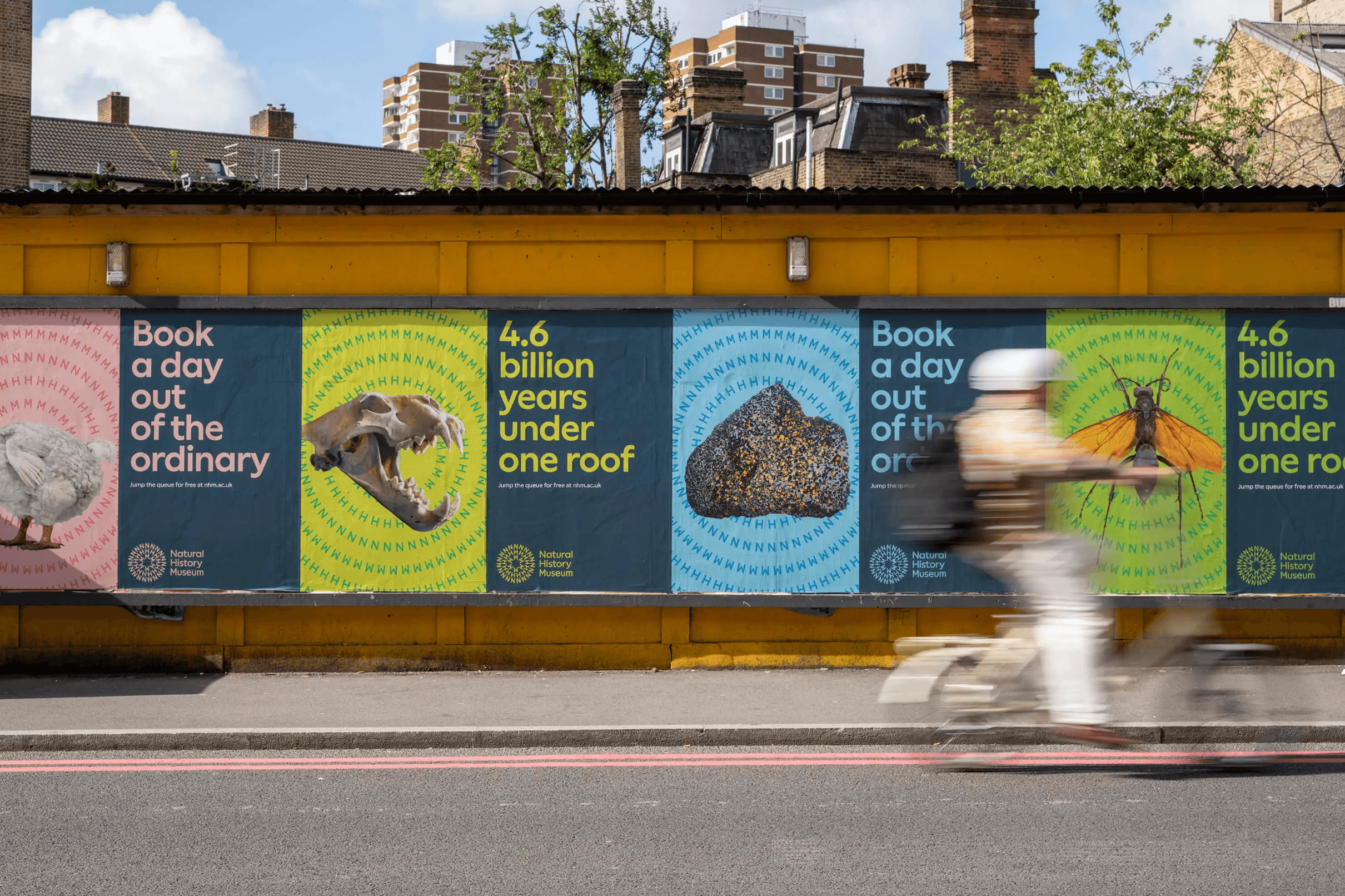
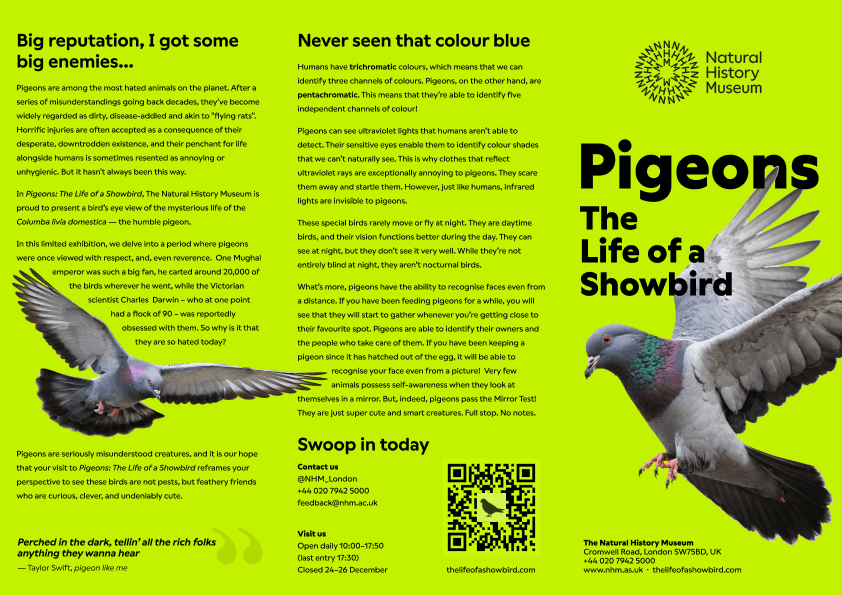
Studying the Natural History Museum's visual identity was the first step. Nomad Studio, the agency behind NHM's current branding, has some of their work publicly available. Their brief was clear: authoritative typography, vibrant colour, and bold imagery—usually photographs. Altogether, this couldn't suggest anything other than centuries-old institutional credibility.
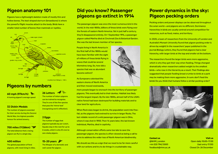
To prepare for creating an exhibit brochure, I refreshed my knowledge of pigeon history. I covered pigeon anatomy, population statistics, and the passenger pigeon's extinction in 1914 (Martha, the last of her kind, died at the Cincinnati Zoo). Everything written in the brochure had to be carefully reviewed and fact-checked.
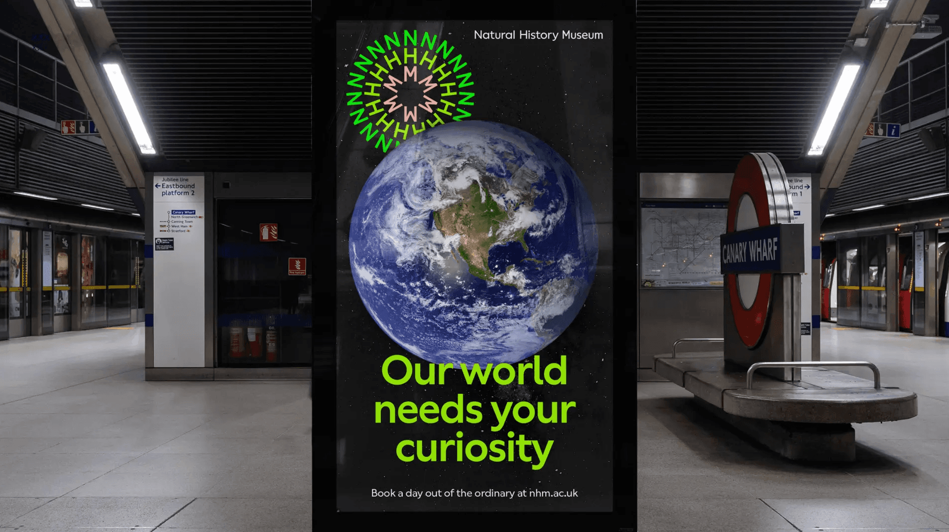
Designing the printable ticket
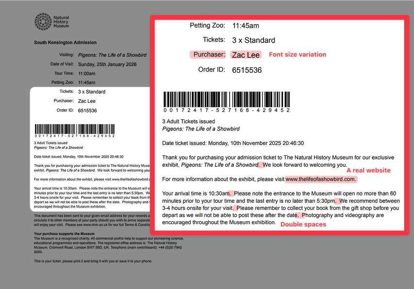
For the ticket itself, getting the typography right was the part I spent the most time on, because it's the part that does the most work. An exhibition ticket that uses the wrong font face or font size reads as a forgery immediately.
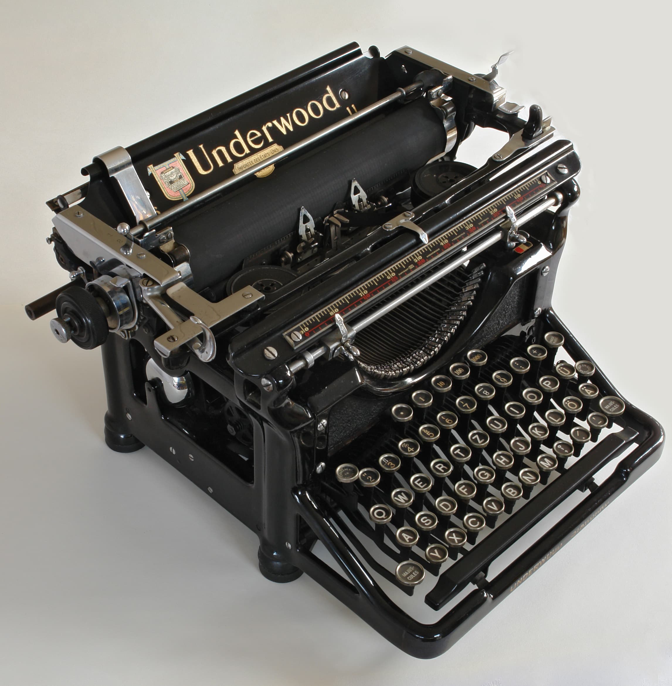
Typography is also where the small, almost imperceptible details live, and those are the ones that do the quiet work of making something feel genuine. One detail I was especially pleased with: two spaces after every full stop.
This was a habit that died with the typewriter. On a mechanical typewriter, every character takes up the same fixed width; a full stop takes up as much space as a capital M. This uniform spacing makes sentences visually blur together, so typists added a second sentence space to create a clear visual break. Later, when proportional fonts arrived (where characters are sized to fit their shape), the double space wasn't needed anymore. But people who learned to type on typewriters carried the habit with them, and many never stopped.
Including double spaces in the ticket copy was a way of encoding an authorial voice, suggesting this text was written by someone who learned to type in a different era, which felt exactly right for a museum founded in 1881.
Would our friend notice the double space? Hell no. But I would know.
Designing and printing a fake museum brochure
Borrowing inspiration and colour palettes from Nomad, I designed the brochure in Figma. It went through probably ten different iterations with feedback from Zac along the way.
I sent the files to instantprint, a print studio based in Rotherham that I highly recommend.
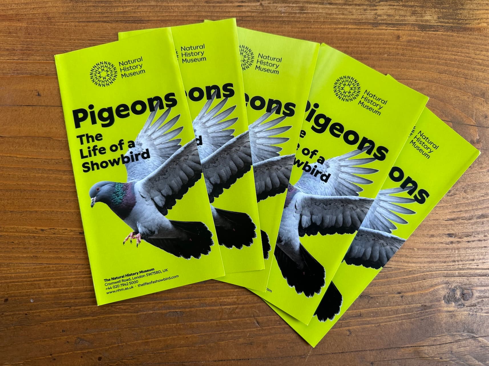
The first run came back with a printing error: the pigeon on the cover was layered incorrectly, obscuring part of the exhibition title. This was a key element of the brochure, and there wasn't an easy way for me to fix it myself. So... I decided to call them.
If you've never had to ring a printing place and explain, in a completely level voice, that the pigeon is in the wrong place on your fake Natural History Museum brochure, I recommend it as a character-building exercise. The customer support team are trained well on refraining from commenting on customers' orders, but I did get one remark.
"I didn't know Taylor Swift had a song called Pigeon Like Me"
"You mustn't be a real fan, then", I joked back.
The second run went perfectly. Daniel and Hannah from instantprint were brilliant, and I'd totally use them again the next time I conspire. I learned all about the different types of paper, print finishes, and fold types. In the end, the configuration that worked best was the double-sided C-Fold leaflet, DL-Third-A4, 150gsm silk, 6pp. The DL flyer is what museums typically use for informational brochures, so it definitely looked the part.
Building the website
Finally, with all the pieces in place, the last thing to do was create a website. I wanted to make the whole thing look even more credible, even just at a surface level, so I needed a basic placeholder site. That way, I could then print the link on the flyer and encode it in a QR code.
This didn't take long with Tailwind Plus and Cursor. It's still live today, and concerningly generating traffic which I hope are just confused bots: thelifeofashowbird.com.
The reveal
There is a specific expression a person makes when they are reading something that looks entirely real and slowly registering that something is deeply wrong. I got to witness this in person on Christmas morning, which I consider a gift to myself.
Our friend went quiet. I watched her face and had absolutely no idea when to step in—this was the part we hadn't planned for. In the end it was Zac—blinking at me to say something, then clearly deciding I was taking too long—who finally broke: "It's not real!"
She loved and hated it enough that apparently the brochure is now pinned up on her fridge, which I find hard to believe and am choosing to take as a compliment.
Seeing our friend's reaction and her rapidly moving through the five stages of grief was the payoff for the unreasonable number of hours spent on this. Thanks to Zaccie for being the perfect partner in crime.
This year's friendsmas will be even better.
P.S. If the Natural History Museum is reading this, yes, I would love to collaborate.