What planes teach us about graphic design
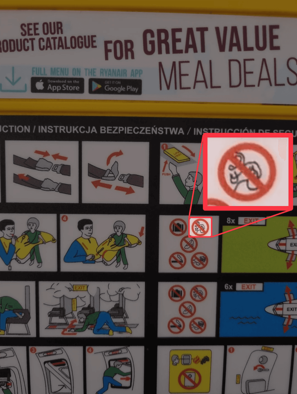
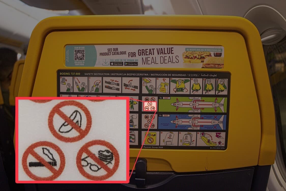
Any time I fly with Ryanair, I am always perplexed by this one very specific icon on the in-flight safety card. It's a series of squiggles and loops that, apparently, I should avoid. Every single time, it takes me at least thirty seconds to remember what on earth it means.
Before I tell you, I'll give you a moment to try and decipher it yourself.
I find this quietly alarming.
Not the instruction itself—"don't let your earrings pop the emergency slide on your way down" is a reasonable ask—but the fact that the icon is so hard to understand. Safety cards aren't meant for relaxed situations at 35,000 feet, they're designed for the worst moment of your life. And in that moment, guaranteed you will not be squinting thoughtfully at a squiggle resembling forbidden pasta. You will need to understand it immediately.
This got me thinking about what is arguably one of the most difficult design challenges: communicating critical information instantly, to anyone. In a crisis on a plane, what is the absolute minimum number of symbols or words required to keep a person alive?
It exposes what most graphic design takes for granted: that people are paying attention and will immediately get the message.
How does aviation use iconography?
On any given commercial flight, passengers will come from dozens of different countries, speaking dozens of different languages. In an emergency, there isn't time for translation. For that reason, aviation leans heavily on pictograms: symbols designed to communicate without words. But not all pictograms are created equal.
The safety card is the purest expression of this idea: a set of life-critical instructions, communicated entirely through small, colourful images. Kinda scary, when you think about it.
Which makes it all the more remarkable that Ryanair's version opens with a full-bleed advertisement for "great value meal deals" with a font size larger than anything else on the life-saving instructions below it.
To give Ryanair some credit, most of the pictograms are doing exactly what they're supposed to do—communicating no high heels, no smoking, no glasses... or false teeth (I have so many questions). The jewellery icon had one job and yet it failed.
How does aviation use typography?
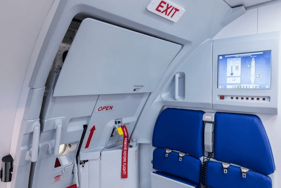
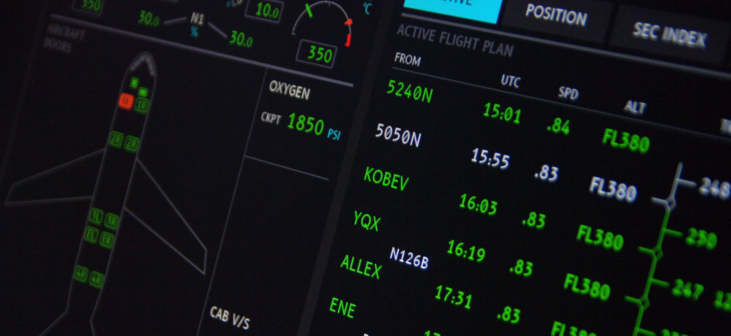
Airbus's A320 is the world's most flown commercial aircraft. If you've taken a short-haul flight in Europe in the last decade, you've almost certainly been on one. It's a great source of inspiration because its cabin is one of the most studied and iterated environments in aviation.
If you look at any text in the A320 cabin, the rules are immediately obvious: everything is uppercase, sans-serif, and well-spaced. In an emergency, you'll be depending on recognition rather than reading. Every typographical decision is purposeful: uppercase sans-serif gives single-word instructions like EXIT or PUSH an unambiguous silhouette. The wide spacing (also known as tracking) stops letters from bleeding into each other.
In fact, font choice is taken so seriously that Airbus actually commissioned a dedicated cockpit typeface, B612, which was developed in collaboration with the French Civil Aviation University (ENAC) and the University of Toulouse. Designers experimented with "confusion matrices", basically tests that helped determine which letters pilots most often mixed up under stress, so that they could tweak them for uniqueness.
How does aviation use colour?
Something I didn't know until recently: exit signs on planes weren't always green with the little running man that's universally known today.
In the UK, Australia, and much of Europe, emergency exit signs are green. In the US, however, they can also be red. So aviation had to solve for both simultaneously. Both conventions make sense in isolation (green for "go", red for "danger"), but both became so deeply embedded in their own countries' building codes and cultural expectations that neither side backed down.
The solution was to standardise on green for international aviation, but the fact that this was ever a debate is a reminder that colour is never neutral. It always carries some assumed meaning. Today, colour in aviation is governed by strict regulations: the FAA in the US, and EASA in Europe. Both specify exactly which colours are allowed for signage, displays, and indicators, down to exact hue and luminance ranges. Designers don't get to pick their palette.
Applying the aviation mindset
Design in aviation is essentially "graphic design with the safety off". It strips away the vanity of aesthetics and forces us to confront a single, brutal question: does this work when everything else is failing? When we apply that same rigour to our own work, we stop designing for the "perfect user" and start designing for the real one.
The stakes might feel lower when a ticketing system goes offline compared to an 85-tonne flying metal box, but the human need for clarity remains identical.
For now, here are the questions aviation design forced me to ask myself.
- Is it immediate? Will they get it before they've had a chance to think? If your icon or label requires a second read, it has already failed.
- Is there redundancy? Aviation uses text, colour, arrows, and physical affordances simultaneously. If your UI relies on colour alone, or an icon alone, you're one failure mode away from nobody understanding it.
- Is it legible under the worst conditions? Will it hold up on small screens, bad lighting, poor internet connection, someone skimming? Keep the worst conditions in mind.
- What assumptions are baked in? The floppy disk is still the save icon in software shipped in 2026. We inherited it and stopped questioning it. Aviation doesn't have that luxury; every symbol has to justify itself from first principles.
The hoop earrings icon fails all of these. It isn't immediate, it relies on an assumption most people don't share, and there's no redundancy to catch you if it doesn't land.
I'll probably still spend my next Ryanair flight squinting at that jewellery icon, trying to remember what it is. But it's a useful reminder for my own work. It's easy to make something look "clean" or "modern"; it's much harder to make it unmistakable. I think I'd rather my work be boring and clear than beautiful and confusing.